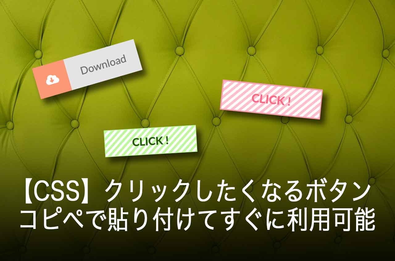

クリックしたい!押してみたい!と思わせるようなボタンをHTMLとCSSだけで作ったサンプルをご紹介します。
ボタンを作るなら、ついつい押したくなるようなボタンのデザインにしてコンバージョン率を高めましょう。
CSSをコピペしてすぐに利用できますので、気に入ったら使ってください。
[adcode]フラットデザイン
年々進化するボタンですが、ここ最近では、フラットデザインが主流になってきています。
Windows8やiOS 7からフラットデザインの開発が進んできました。
よく見るブログやネットショッピングのボタンもフラットデザインを取り入れられています。
そこで今回は、フラットデザインのボタンを紹介します。
おしゃれな見出し用CSSサンプル集をご覧になりたい方は、以下へ進んでください。
参考 おしゃれな見出し用CSSデザイン集!WordPressブログにコピペするだけ!
シンプル系ボタン
- HTMLとCSSを見るには右の をクリック
-
<div class="button-sample">
<a href="#" class="flat-button01">CLICK !</a>
</div>
.button-sample{ margin: 0; padding: 0; text-align: center; } .button-sample .flat-button01 { display: inline-block; padding: 8px 20px; text-decoration: none; color: #84b78c; font-weight: bold; background: #e0fce5; border: solid 1px #84b78c; border-radius: 3px; transition: .4s; } .button-sample .flat-button01:hover { background: #84b78c; border: solid 1px #84b78c; color: #FFF; }
- HTMLとCSSを見るには右の をクリック
-
<div class="button-sample">
<a href="#" class="flat-button02">CLICK !</a>
</div>
.button-sample{ margin: 0; padding: 0; text-align: center; } .button-sample .flat-button02 { display: inline-block; padding: 8px 40px; text-decoration: none; color: #FFF; font-weight: bold; font-size: 16px; background: #6681a5; border: solid 1px #6681a5; border-radius: 30px; transition: .4s; } .button-sample .flat-button02:hover { background: #FFF; border: solid 1px #6681a5; color: #6681a5; }
ワンポイントデザインボタン
- HTMLとCSSを見るには右の をクリック
-
<div class="button-sample">
<i class="fa fa-chevron-right"></i> <a href="" class="flat-button03">CLICK !</a>
</div>
.button-sample{ margin: 0; padding: 0; text-align: center; } .button-sample .flat-button03 { position: relative; display: inline-block; font-weight: bold; padding: 5px 30px; text-decoration: none; color: #FFF; background: #ff546d; border-radius: 0; transition: .4s; } .button-sample .flat-button03:hover { text-decoration: none; background: #12cec1; }
- HTMLとCSSを見るには右の をクリック
-
<div class="button-sample">
<i class="fa fa-home"></i> <a href="#" class="flat-button04">HOME</a>
</div>
.button-sample{ margin: 0; padding: 0; text-align: center; } .button-sample .flat-button04 { position: relative; display: inline-block; font-weight: bold; padding: 5px 30px; text-decoration: none; color: #FFF; background: #e8be3a; border-radius: 0; transition: .4s; } .button-sample .flat-button04:hover { text-decoration: none; border: solid 1px #e8be3a; background: #FFF; color: #e8be3a; transform: scale(1.1); transition-duration: 0.5s; }
- HTMLとCSSを見るには右の をクリック
-
<div class="button-sample">
<i style="vertical-align: middle" class="fa fa-download fa-2x"></i> <a href="#" class="flat-button05">Download</a>
</div>
.button-sample{ margin: 0; padding: 0; text-align: center; } .button-sample .flat-button05 { position: relative; display: inline-block; font-weight: bold; padding: 8px 30px; text-decoration: none; color: #FFF; background: #45b1e8; border-radius: 20px; transition: .4s; } .button-sample .flat-button05:hover { text-decoration: none; border: solid 1px #45b1e8; background: #FFF; color: #45b1e8; } .button-sample .fa-2x { font-size: 1.5em; }
- HTMLとCSSを見るには右の をクリック
-
<div class="button-sample">
<a href="#" class="flat-button06">友達に送る</a>
</div>
.button-sample{ margin: 0; padding: 0; text-align: center; } .button-sample .flat-button06 { position: relative; display: inline-block; font-size:16px; /*文字サイズ*/ height: 50px; line-height: 50px; padding: 0 20px 0 70px; text-decoration: none; color: #707070; background: #e5e5e5; } .button-sample .flat-button06:before{ content: "●"; position: absolute; left: 0px; top: 0; padding:0 15px; /*タイトル部の長さ*/ font-size:16px; /*文字サイズ*/ background: #fc9876; color: #fff; } .button-sample .flat-button06:hover { text-decoration: none; border: solid 0px #ef4628; background: #fc9876; color: #fff; }
- HTMLとCSSを見るには右の をクリック
-
<div class="button-sample">
<a href="#" class="flat-button07">Download</a>
</div>
.button-sample{ margin: 0; padding: 0; text-align: center; } .button-sample .flat-button07 { position: relative; display: inline-block; font-size:16px; /*文字サイズ*/ height: 50px; line-height: 50px; padding: 0 20px 0 70px; text-decoration: none; color: #707070; background: #e5e5e5; } .button-sample .flat-button07:before{ font-family: "Font Awesome 5 Free"; font-weight: 900; content: '\f381'; position: absolute; left: 0px; top: 0; padding:0 15px; /*タイトル部の長さ*/ font-size:16px; /*文字サイズ*/ background: #fc9876; color: #fff; } .button-sample .flat-button07:hover { text-decoration: none; border: solid 0px #ef4628; background: #fc9876; color: #fff; }
- HTMLとCSSを見るには右の をクリック
-
<div class="button-sample">
<a href="#" class="flat-button08">資料請求をする</a>
</div>
.button-sample{ margin: 0; padding: 0; text-align: center; } .button-sample .flat-button08 { position: relative; display: inline-block; font-size:16px; /*文字サイズ*/ height: 50px; line-height: 50px; padding: 0 20px 0 70px; text-decoration: none; color: #707070; background: #e5e5e5; } .button-sample .flat-button08:before{ font-family: 'Font Awesome 5 Free'; font-weight: 900; content: '\f658'; position: absolute; left: 0px; top: 0; padding:0 15px; /*タイトル部の長さ*/ font-size:16px; /*文字サイズ*/ background: #1da1f3; color: #fff; } .button-sample .flat-button08:hover { text-decoration: none; border: solid 0px #ef4628; background: #1da1f3; color: #fff; }
ラインを入れたボタン
- HTMLとCSSを見るには右の をクリック
-
<div class="button-sample">
<a href="" class="flat-button09">CLICK !</a>
</div>
.button-sample{ margin: 0; padding: 0; text-align: center; } .button-sample .flat-button09 { position: relative; display: inline-block; font-weight: bold; padding: 5px 40px; text-decoration: none; color: #f96b84; border: solid 2px #f7a0af; background: #f9e0ef; border-radius: 0; background-image: linear-gradient(-45deg,#fff 25%,#ffc0cb 25%, #ffc0cb 50%,#fff 50%,#fff 75%,#ffc0cb 75%, #ffc0cb); background-size: 10px 10px; transition: .4s; } .button-sample .flat-button09:hover { background-image: linear-gradient(-45deg,#ffc0cb 25%,#fff 25%, #fff 50%,#ffc0cb 50%,#ffc0cb 75%,#fff 75%, #fff); background-size: 10px 10px; border: none; text-decoration: none; }
- HTMLとCSSを見るには右の をクリック
-
<div class="button-sample">
<a href="" class="flat-button10">CLICK !</a>
</div>
.button-sample{ margin: 0; padding: 0; text-align: center; } .button-sample .flat-button10 { position: relative; display: inline-block; font-weight: bold; padding: 5px 40px; text-decoration: none; color: #255607; border: solid 1px #c0f79e; background: #c0f79e; border-radius: 0; background-image: linear-gradient(-45deg,#fff 25%,#c0f79e 25%, #c0f79e 50%,#fff 50%,#fff 75%,#c0f79e 75%, #c0f79e); background-size: 10px 10px; transition: .4s; } .button-sample .flat-button10:hover { background-image: linear-gradient(-45deg,#c0f79e 25%,#fff 25%, #fff 50%,#c0f79e 50%,#c0f79e 75%,#fff 75%, #fff); background-size: 10px 10px; border: solid 1px #c0f79e; text-decoration: none; }
- HTMLとCSSを見るには右の をクリック
-
<div class="button-sample">
<a href="" class="flat-button11">CLICK !</a>
</div>
.button-sample{ margin: 0; padding: 0; text-align: center; } .button-sample .flat-button11 { position: relative; display: inline-block; font-weight: bold; padding: 10px 40px; text-decoration: none; color: #255607; border-top: solid 1px #11abf7; border-bottom: solid 5px #11abf7; border-left: solid 1px #11abf7; border-right: solid 1px #11abf7; background: #b5def2; border-radius: 0; transition: .4s; } .button-sample .flat-button11:hover { border-top: solid 10px #11abf7; border-bottom: solid 1px #11abf7; border-left: solid 1px #11abf7; border-right: solid 1px #11abf7; text-decoration: none; }
アフィリエイトで有名なカエレバのCSSを変更できます。変更するには以下の記事を参考にしてください。
参考 カエレバのCSSをカスタマイズ!コピペでOK(レスポンシブ対応)-Amazon・楽天商品・アフィリエイト
[adcode]まとめ
ボタンのデザインは、クリック率に大きく影響すると言われています。
今回は、最近流行りのフラットなデザインを集めてみました。随時、追加していきますので、気に入ったボタンがあったら使って下さい。